thumbnail.jpg

Alphabit


Some things are created the way they are, and not meant to be altered. Typefaces such as Courier were designed before the digital age, forged and immortalized into physical lead letters. Courier now comes standard on most operating systems, but its history of being a purely typewriter font seems to conflict it’s current use on the web. My typeface Alphabit is based off of the same premise as this change in use of typography. 


One-Star-App.jpg


It is designed to be the most stubborn and least dynamic typeface possible. Playing upon the principles of anti-aliasing (another way of describing how a screen pixelates displayed content), the pixelated type only truly appears “normal” once it is small enough so the pixels of the typeface are the same size as the pixels on your screen. In this metaphor about how physical text faces become display faces for the screen, but this process destroys the beauty of type.


modern_computer.png


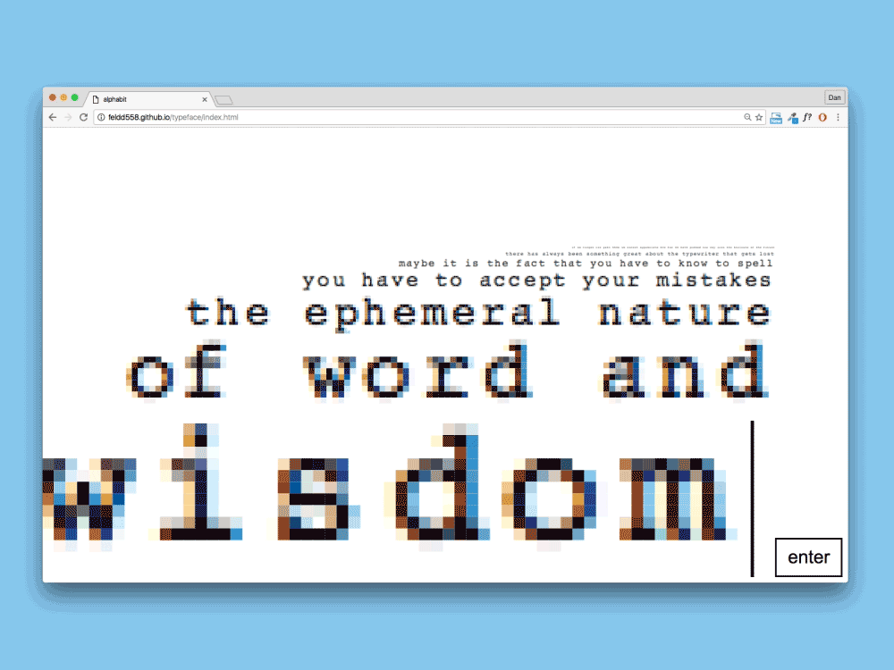
I formed each letter of square pixels with individually chosen and coded colors. Upon interacting with the type specimen website, a message is preloaded onto the screen. Once the enter key is pressed, the message disappears and you can type your own message. Every time you hit the enter key after that, the message moves a line up, and consequentially becomes smaller.


Alphabit.gif


By the time the message is at the last line, it finally does not appear pixelated, but it barely legible instead. There is no backspace key, and everything you type is there to stay unless it is preceded by more lines. This interaction is based off of the principles of the typewriter.


tumblr_n6apmlV8MJ1sh3pvuo1_1280.jpg